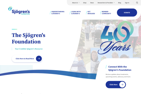
The Sjögren's Foundation
Bright Plum’s strategic Drupal partnership enabled the Sjögren's Foundation to stabilize its website, automate operations, and redirect resources toward patient advocacy.

Introduction
The Sjögren's Foundation is a nonprofit organization dedicated to increasing awareness, providing support, and advancing research for Sjögren's syndrome, an autoimmune disease primarily affecting the glands that produce saliva and tears.
The foundation offers educational resources, patient support services, and advocates for improved healthcare policies. It also funds research to enhance the diagnosis, treatment, and understanding of Sjögren's syndrome, aiming to improve the quality of life for those affected by the condition.
The Sjögren's Foundation website serves as a comprehensive resource for individuals affected by Sjögren's syndrome, providing information on the disease, educational materials, and updates on the latest research and treatments.
The website offers access to patient support services, including support groups and helplines, and serves as a platform for advocacy efforts aimed at improving healthcare policies and awareness. Additionally, it connects visitors with opportunities to participate in and support ongoing research initiatives to better understand and manage Sjögren's syndrome.
Learn more about The Sjogrens Foundation here: https://sjogrens.org/
Maximizing the Mission Impact of a Non-Profit Health Organization
The Sjögren's Foundation is the first and only national non-profit health organization leading the charge to conquer Sjögren's, a systemic autoimmune disease affecting up to 4 million Americans. The Foundation faced a critical crisis.
Their Drupal website hadn’t been updated in six months, the auto-renewal system wasn’t processing payments correctly, and marketing staff were getting overwhelmed with manual workarounds.
Bright Plum's white-glove approach helped transform the Foundation’s website into a stable, secure, and scalable platform. We moved the site to more reliable hosting, refactored all custom code to follow Drupal best practices, and automated manual processes that were consuming 25-30 hours of monotonous labor.
The result: a website that allows the Foundation to focus on its mission instead of fighting technical fires.
Highlights
- Crisis Resolution in 90 Days - Transformed an unmaintainable website with 6+ months of security vulnerabilities into a stable platform, working through the holiday season to meet the Foundation's urgent needs.
- Automated Processes to Eliminate Staff Burnout - Reduced manual workload by an estimated 25-30 hours per month, automating member renewals, data exports, and account management tasks.
- Fixed Critical Revenue Operations - Rebuilt the auto-renewal membership system to process payments reliably, eliminate duplicate email notifications, and ensure consistent revenue flow for the organization's operations.
- Enhanced the Member Experience - Implemented member-specific pricing and streamlined access to resources for the Sjögren's patient community.
Membership System Automation and Revenue Protection
The auto-renewal system for memberships required staff to manually track expirations and process renewals.
Members were receiving duplicate emails or no notifications at all, leading to confusion and potential revenue loss.
We rebuilt the entire system using proper batch processing, implemented automated member status updates, and created reliable notification workflows.
The new system processes monthly renewals automatically, includes 3-day expiration warnings, and handles account suspensions without staff intervention.
Configuring Tools For Administrative Efficiency
Staff were spending excessive time on manual data entry and couldn't export member information for analysis or reporting.
We added custom reporting columns to the admin interface, implemented CSV export functionality for member data, and trained staff on Drupal's native capabilities.
These improvements transformed how the Foundation manages its membership database and streamlined data-driven decision-making for the organization's growth strategies.
Maximizing Value for Members
The Foundation's online shop and member pricing system were unreliable, with all prices visible to non-members and manual processes for conference registrations.
We implemented member-specific pricing with automatic discounts, enhanced the product management interface, and integrated new product types for conferences.
Custom messaging displays appropriate renewal prompts to members, reducing confusion.
This improved the member experience while creating clear value propositions for Foundation membership.
Improved Content Management and Editorial Control
The Foundation's staff needed better tools to manage their growing content library and communicate effectively with their community.
We helped put content management back in the hands of non-technical staff. Editors can now surface critical information to display on the homepage.
Images can be uploaded, aligned, and formatted easily, all while maintaining accessibility.
Peace of Mind and Operational Confidence
We established proactive communication through shared Slack channels, implemented staging environments with visual regression testing, and created deployment schedules that avoid critical business periods.
Security updates are maintained, and improvements suggested.
We continually monitor membership renewal processes and provide real-time support, ensuring the Foundation's staff can focus on patient advocacy rather than technical troubleshooting.
- Website redesign
- New integrations
- New custom features